For the last while, I’ve been playing with oil paints and enjoying it. I’ve learned a lot and been happy with what I’ve done but it doesn’t feel like ‘home’. I began a portrait in oils, which you can see here. While I’ve drawn other portraits successfully in pencil I had told myself I couldn’t paint one. (Silly me. I made up a rule and hadn’t questioned it.)
It turned out just okay because it didn’t look anything like my friend. I missed the detailed sketch which is how I start all my watercolours. I enjoy drawing and that sketch lays down a ‘map’ to guide me when painting. With oils, as soon as I put on the first layer of paint, I lose the drawing underneath.
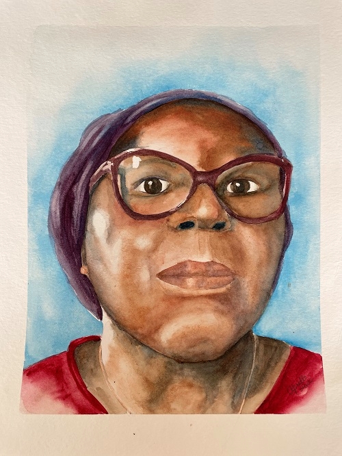
That’s what made me decide to try the portrait again in watercolour. The whole process felt like coming home as soon as I started working and I’m much happier with the results.
Here’s my process.
Starting with a detailed sketch on drawing paper, I took a lot of measurements and worked out the relationships between the features. Using the full head as a measure of “1”, I asked what were the ratios between each feature and the position on the head? How did the eyes line up to the lips? What was the space between the eyes? Lots of measuring takes time but it makes the painting itself go much faster.
Once the initial sketch was complete I transferred it to 140lb cold press watercolour paper. Then I lightly penciled in where I wanted the highlights to remain and where I wanted to deepen the shadow. I added a bit of masking to the highlights in the eyes, the glass and the edge of the frames that caught the sunlight. No mask on the cheek highlight however, as I wanted soft edges to that. Now I had my road map.
Next I put these colour choices on my palette:
- Phthalo blue (Winsor Newton)
- Alizarin crimson Hue (Winsor Newton)
- Faience Blue (Maimeriblu)
- Burnt sienna (Winsor Newton)
- Burnt Umber (Lukas)
- Indigo blue (Winsor Newton)
Knowing the white of the paper is my lightest light, I mix what will begin as the darkest dark knowing I almost always end up going darker as I refine the painting. But it’s a starting point and it helps me mix and establish the mid-tones.
After dampening the background, I did a wash of Pthalo Blue, allowing it to soften around the edges so that it formed a frame for the face. Alizarin Crimson went on the t-shirt and then I mixed the two to create the purple for the head scarf and some of the shadowing. Restricting my palette and using a mix means I know the colours will be harmonious.
A very light wash of Alizarin went on the skin except for the places I wanted to keep pure white. Actually, it’s less of a wash and more of a ‘dirty’ brush of water tinted with paint. It gives the undertone of the skin some warmth. Barely there, but I feel it helps create the illusion of life I’m striving for.
Then it was a matter of painting the features. Establishing hard and soft edges. Deepening shadows for the illusion of roundness. Keeping the colour lighter where the sun hit. Deepening shadows with the mixed purple and Faience Blue. As I worked back and forth, it was easy to establish those mid-tones and tweak the shapes.
I usually do the eyes first on any portrait because if they’re not right, nothing else works. But this time I left them to almost last because of the glasses. I painted the inside of each lens separately but the skin tones had to appear seamless. I didn’t want to risk contaminating the whites of the eyes while I fiddled with the area around them.
When I finally painted in the eye itself, I used the Indigo as the black for the irises. I don’t like using a pure black in my paintings and will either mix one or for tiny areas like this, use the Indigo.
The eyeglass frames were a mix of the purple and burnt sienna.
When it was all done and dry, I removed the masking.

I have to say I’m much happier with this painting and I’ve had a lot of positive feedback on it, too. (Thanks to everyone who liked and commented on social media.)
I really feel the underlying sketch, knowing how to handle my materials and the translucence of watercolor made this one work for me. It captured the play of sunlight across my friend’s face that drew me to take the original photo. I also had some with her fully smiling (which is her usual mode) but I chose this one for the dignity and strength in that expression (and that little Mona Lisa smile).
It’s fun to experiment with other mediums and try other things but it’s also very satisfying to come home and work with what’s familiar, tried, and true.


This is really lovely, Aprille! You did such an awesome job on the eyes and glasses, AND the skin!!!!! and yes, I can really tell this is a much loved medium, for you!!!!
Thanks Hilda. I enjoy learning new things and stretching my borders but watercolour will always be my happy place.
Aprille,
A beautiful portrait. And a good reminder to try new things – or we’ll never know what home is! Nothing wrong with being in your comfort zone.
Helen
I love that idea – that stretching our boundaries can remind us of good it safe space can feel. Mmm. I think there’s a life lesson in there. 😉